
Work
Case Library — Three web projects focused on conversion, clarity, and systems.
- Conversion
- UI System
Increasing qualified inquiries for a legal website
Clear IA, stronger CTAs, and early trust signals to increase qualified inquiries.
Role
Senior UX/UI Designer
Focus
High-intent pages
Outcome
~50% inquiry uplift
Expand case
Context
High-intent pages dropped off before contacting.
Trust signals and CTA hierarchy were inconsistent across templates.
Problem
- Users couldn’t identify services quickly
- CTAs buried below fold with inconsistent placement
- Credentials and proof appeared too late in flow
Goals
- Increase inquiry submissions from high-intent pages
- Clarify service offerings at first scan
- Surface trust signals early in flow
Key Decisions
Decision
Why
Tradeoff
Navigate by service type
Users self-identify faster than browsing firm structure
Longer menu, clearer intent paths
Decision
Why
Tradeoff
Dual CTA placement
Capture both skimmers and deep readers
Adds repetition, measurably lifts conversion
Solution Highlights
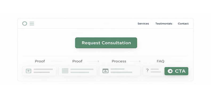
- Redesigned homepage with service blocks and outcome-driven headlines
- Standardized CTA placement (sticky header + above fold + footer)
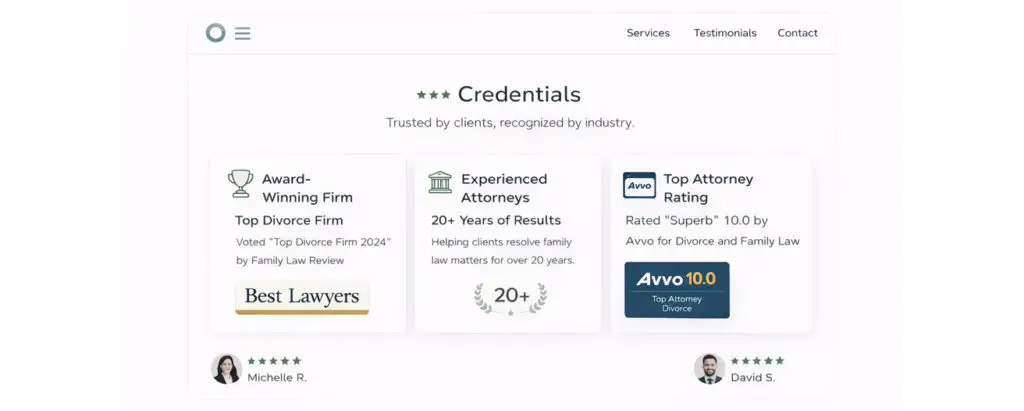
- Added trust signals: credentials, client testimonials, case outcomes
- Surfaced trust signals: credentials, testimonials, case outcomes
- Built reusable page patterns for future templates
Visual Highlights
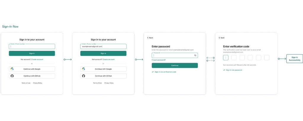
Hero → Proof → Process → FAQ → CTA

Outcome
+~50% inquiry submissions (selected pages / selected period)
Reusable page patterns reduced iteration time
Insight: Higher-quality leads reported (client feedback)
What I'd do next
- Instrument CTA → form start → submit tracking
- A/B test hero messaging and proof order on top pages
- E-commerce
- Mobile
Reducing cart abandonment in jewelry e-commerce
Streamlined checkout flow to reduce friction and increase completed purchases.
Role
UX/UI Designer
Focus
Checkout & mobile
Outcome
~15% sales uplift

Expand case
Context
Cart abandonment ~68%
Mobile = ~60% of traffic, underperforming conversions
Problem
- Too many steps—users dropped off before payment
- Mobile experience clunky—small fields, hard-to-tap buttons
- Forced account creation blocked first-time buyers
Goals
- Reduce checkout steps from 5 to 3
- Improve mobile tap targets and form usability
- Add guest checkout to reduce friction
Key Decisions
Reduce steps without reducing trust.
Decision
Why
Tradeoff
Combine shipping + billing
Most users have the same address—default to single form with optional override
Adds complexity for edge cases, but reduces steps for 90% of users
Decision
Why
Tradeoff
Guest checkout first
First-time buyers want speed—offer account creation after purchase
Reduces email capture, but increases conversion
Solution Highlights
- Reduced checkout to 3 steps with clear progress indicators
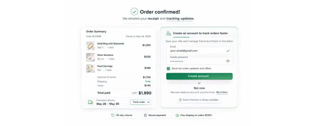
- Enabled guest checkout by default, offered account creation post-purchase
- Optimized mobile forms: 44px tap targets, autofill, inline validation
- Added trust signals: security badges, return policy, support access
Visual Highlights
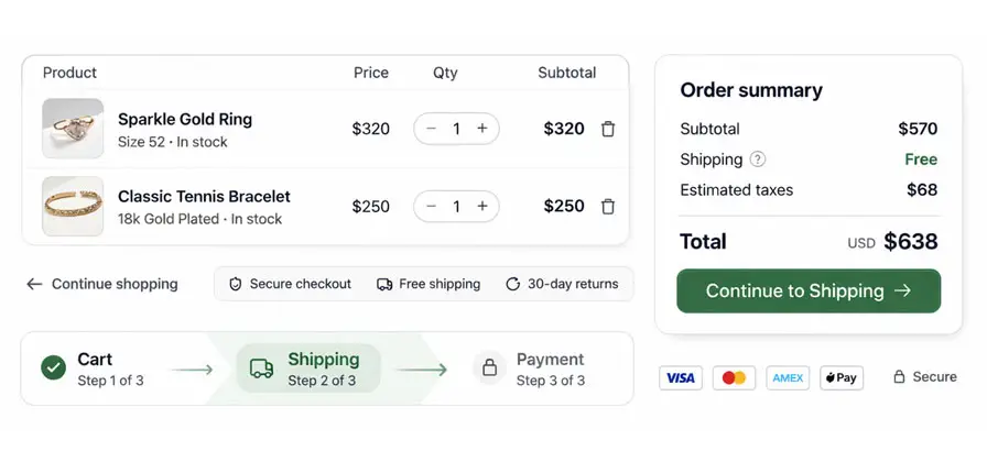
Cart → Shipping/Billing → Payment
Outcome
+~15% completed purchases (selected period)
+22% mobile conversion rate (post-launch, 3 months)
Insight: Guest checkout became the primary path for first-time buyers.
What I'd do next
- Test one-page checkout for returning customers with saved payment methods
- Add Apple Pay / Google Pay to reduce mobile checkout friction
- Fintech
- Systems
Fintech: Onboarding/KYC flows (Redacted)
Comprehensive state management for secure fintech onboarding with robust error handling.
Role
Product Designer
Focus
KYC states & patterns
Outcome
Robust state coverage
Expand case
Redacted case study: Screens are representative and use mock data to respect confidentiality.
Context
Fintech startup needed a compliant KYC onboarding flow. This case is redacted to respect confidentiality—visuals and metrics are generalized. Focus is on systems thinking and state management.
Problem
- Complex verification states (pending, approved, rejected, expired) lacked clear UI patterns
- Error messages were generic—users couldn’t recover without support
- No design system—engineers built inconsistent UI for each state
Goals
- Map all KYC states and edge cases (success, pending, error, timeout, retry)
- Design clear recovery paths for failed verification
- Build reusable state patterns for future flows
Key Decisions
Decision
Why
Tradeoff
State-first design
KYC is a state machine—design for every transition, not just happy path
More upfront work, but reduces eng back-and-forth and bugs
Decision
Why
Tradeoff
Actionable error messages
Generic errors create support tickets—give
users clear next steps
Requires deeper content strategy, but improves recovery rates
Solution Highlights
- Mapped 12+ KYC states with UI patterns for each (pending, success, error, retry, timeout, expired)
- Designed state-specific messaging with clear recovery actions
- Built reusable components: status cards, error blocks, loading states, retry buttons
- Created detailed specs for edge cases (network errors, timeouts, duplicate submissions)
- Delivered comprehensive state diagram and component library to engineering
Visual Highlights
Cart → Shipping/Billing → Payment
Outcome
Reduced engineering back-and-forth during handoff by ~40% (observed internally).
Reusable patterns enabled faster iteration on future flows. Error recovery paths reduced support tickets.
What I'd do next
- Add biometric verification option (Face ID / Touch ID).
- Test progressive disclosure for complex KYC fields
- Build an admin dashboard for manual review cases